Sunday, August 5, 2007
Thursday, May 24, 2007
Realgrain Plugin Review
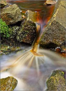
Convincing Black And White Digital Photographs
I feel comparing black and white digital photography with it's film equivalent is like comparing apples with oranges. They just are not the same thing in look and feel. I discussed this in detail in part 1 of this series. When speaking with photographer Hellen Van Meene she describe film as having "magic". Now I'm not sure what the techical term for magic is but creatively I know exactly what Hellen means.
Until very recently I didn't really feel there was anything available for the digital photographer that would add that magic to a black and white digital photograph. I already knew from bitter experience that transforming a colour digital photograph into a convincing black and white print is very difficult and can be inconsistant and unconvincing.
I felt the end results could be lacklustre and the process time consuming. Also doing excellent black and white conversion is beyond most peoples abilities. People want to take pictures not program computers. I resigned myself to shooting rolls of black and white film and paying exhobitant sums of money to develop them. This was the situation until I discovered some software called Realgrain.
Realgrain is a plugin for photoshop made by Imagenomic makers of the excellent Noiseware program. Essentially Realgrain claims to mimic the visual effect of various colour and black and white film stocks. Classic films such as Fuji Velvia 50 or Kodak Tri-X 400. I tried it out to see if these claims where true. I began by experimenting with the black and white film conversion.
Accessing the plugin is simple it sits in the menu of Photoshop with all the other filters and plugins and is simply selected from the drop down menu. Selecting a film type for conversion is equally simple. You just select a group from a drop down list. In this case Black and White Films. Then select a specific film from the second list.
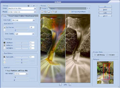
In this first screen shot I have converted the colour image at the begining of the article into a simulated Kodak Tri-X 400. I have to say that the conversion impressed me at once as this was my usual choice of black and white film stock and it looked very close to the original to me. You can also control luminance, grain density and tonal range to gain the effect you want quickly and easily.
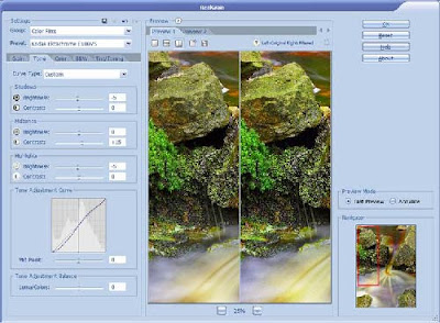
The second screenshot is a conversion to a colour film stock demonstrating that you can also adjust the tone curve for the shadows, midtones and highlights. Much as you would do in the darkroom by adjusting your developing and printing processes. Only on this occasion it's cheaper, cleaner and you have an UNDO button.
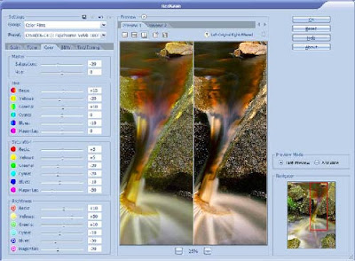
On the third screenshot i've done a simmulated cross processed effect and you can also see I have available a control pannel to take total control over the hue and saturation value of every colour in the photograph.
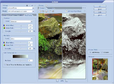
In the forth and final screenshot I have selected a simulated infrared conversion and have also showed the forth control pannel which allows you too tone the image as you would in a darkroom. With options such as Platinum/Silver available. You can also easily set the tone balance and add colour tints with the click of a mouse.
I have to say I am completely sold on this wonderful plug-in. It does it's job superbly well and is very easy and intuitive to use. It's not processor hungry so it works efficiently on any reasonable PC. I tested on a 2.6Ghz Athlon machine with 2Gb of memory and a conversion took around 6 seconds on a 60Mb .TIF file. The plug-in works on 8bit and 16bit files also. It's also a total bargain as it weighs in at a humble £45 ($90)
Please note I recommend things I like and find useful and good value. My opinion is not for sale.
Friday, March 30, 2007
Cooking On Photography Trip
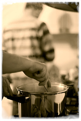 A photograph of two of my photographer friends cooking up a feast on a creative weekend away. I've been using this image and others to test Imagenomic's Realgrain. It's a photoshop plug-in which simulates film and darkroom effects on digital files. I'll post an article on with my thoughts on it soon.
Friday, March 9, 2007
Portraits Of Strangers - 3
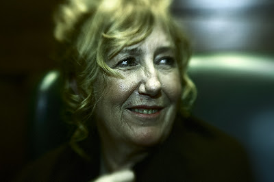
Beauty can be seen in all things, seeing and composing the beauty is what separates the snapshot from the photograph.
- Matt Hardy
Portraits Of Strangers - 2
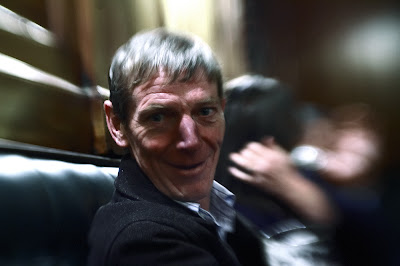
There are always two people in every picture: the photographer and the viewer.
- Ansel Adams
Thursday, March 8, 2007
Portraits Of Strangers
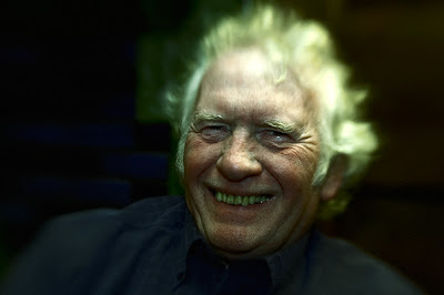
Usually I think if there is something imperfect in a photograph it makes the picture more real. Photographs that are slick, smooth, and perfect seem less honest to me.
- John Loengard, "Pictures under discussion" by John Loengard,
ISBN: 0817455396
Candid Photography Advice
Wednesday, March 7, 2007
Conclusion - Seven Deadly Sins Of Photography
The virtue of the camera is not the power it has to transform the photographer into an artist, but the impulse it gives him to keep on looking.
- Brooks Atkinson, 1951, "Once Around the Sun"
Wrath - Seven Deadly Sins Of Photography
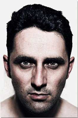
Wrath is disproportionate and uncontrolled feelings of hatred, frustration and anger. These feelings manifest as a denial of the truth, both to others and to ourselves. Our anger is often our first reaction to the problems of others. Impatience with the faults of others is often related to this.
Friday, March 2, 2007
Greed - Seven Deadly Sins Of Photography
This is about more than being acquisitive and demanding. It's about NOT letting others get the credit or praise for their part. It is NEVER giving without having expectations of the other person. Greed wants to get its 'pound of flesh' or a bit more...
Thursday, March 1, 2007
What Is Street Photography Anyway?

Son Of A Shameless Plug
Tuesday, February 27, 2007
Gluttony - Seven Deadly Sins Of Photography
Gluttony: does not accept the natural limits of your needs. It does not preserve any natural balance. This does not pertain only to food, but to entertainment and the pursuit of material goods...
Option 2: The confusion of so many creative tools available causes endless mistakes, missed opportunities and botched images. Their potential is hindered not helped by their gluttonous acquisition of photographic equipment.
Lust - Seven Deadly Sins Of Photography
LUST: Self control and self mastery prevent pleasure from killing the soul by suffocation. Lust is the self-destructive drive for pleasure out of proportion to its worth. Sex, power, or image can be used well, but without knowledge of yourself they tend to go out of control...
Friday, February 23, 2007
Digital Workflow - (Part3) - Clones and Space Invaders
Hellen Van Meene interview goes live.
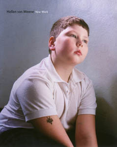
Hellen felt part of her talent as a photographer was to draw something more out of her models something from within them. She felt sometimes this meant strong direction of her models which often means having to ask them how to pose or how to look. Guiding them through the process. Her description of this was dramatic referring to it as "like sculpting on a living soul" She feels a strong responsibility for her models and the look she gives them as she has chosen them in the first place for qualities they are perhaps unaware they have at this point. She adds after pausing for thought "I try to get the best things out of them. If it means I have to turn her around or anything else, it’s my responsibility and that is a big challenge every time. It’s too easy to make a photo of an insecure girl. I mean…there’s nothing in it. It’s much more of a challenge to take an insecure girl and change her into Queen Elizabeth. That’s more difficult".
Thursday, February 22, 2007
Sloth - Seven Deadly Sins Of Photography
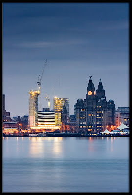
SLOTH: The other sins work together to deaden the senses so we first become slow to respond then drift completely into the sleep of complacency. In short we become a lazy good for nothing photographer.
NOTE: The sin of photographic sloth should not be confused with photographing sloths which is a noble though slightly obscure pass time of wildlife photographers.
Pride - Seven Deadly Sins Of Photography
PRIDE: Seeing ourselves as something we are not. Pride and vanity are also collaborative. If someones pride really gets your goat, then you have a lot of pride.
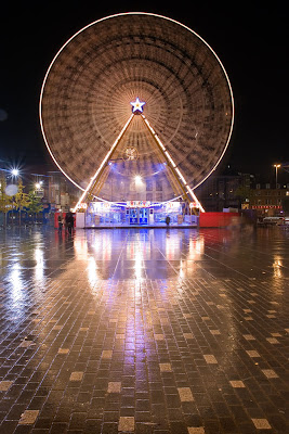
In photography the sin of pride is a devastating sin. It will prevent you learning. It will prevent you accepting advice. It will make many a potential mentor shun you without you ever realising they have. Your development into a talented photographer will simply never occur. And why is that you ask? There's a simple and obvious answer to the question. If you are so prideful that you already believe you are a great photographer why would you struggle to actually be one? If you are so vain as to believe you already know best how can you ever listen and learn to a more experienced photographer? How can you ever see virtue in the work of anyone else if you are already the greatest? Also why on earth would anyone want to pause and help anyone so arrogant as yourself?
Now opening up to the fact that you are not the greatest at landscape, portrait, street or whatever type of photographer is difficult. You must subsume that huge ego. John Cleese once described this process of divesting yourself of ego as going to sleep thinking you're Atilla The Hun but waking up to find your a Budgie. Now it's very difficult to accept you are not always perfect but the benefits are enormous. If you are open to the fact you are flawed and have room to improve. You begin to strive to improve. You begin to be honest and examine your work more critically. You learn to listen and to take on board the opinions of others. That's how you grow as a photographer. It's how you approach greatness.
If you follow that advice then I am sure that one day you will be very proud of your accomplishments in photography. On that day being justifiably happy with what you've worked hard to accomplish is an entirely different ball game to just deluding yourself about your own greatness.
PS: The picture in the article is:
A/. The greatest picture ever taken.
B/. Has been posterized to hide the fact it's out of focus.
Which point of view will help me improve the most?
Friday, February 16, 2007
Envy - Seven Deadly Sins Of Photography
ENVY: Resents the good others receive or even might receive. Envy irrationaly ignores the reasons for other peoples good fortune and despises the success of others.
Camera envy is one of the deadly sins of photography for a very good reason. It gives people the delusional excuse that if only they had the same camera as photographer x,y or z then they would take the same wonderful pictures as them. This insidious little delusion manages to insult the talent of the accomplished photographer by crediting only their equipment while simultaneously excusing them from responsibility for their own creative ability.
Rather than argue about the importance of what camera you use I will simply quote three professional photographers I interviewed recently and you'll see the pattern emerge yourself.
Deutsche Börse nominee Philippe Chancel when speaking about his work was interrupted by the cry of 'Great prints! What camera do you use?' looking very confused for a moment he said the following.
35mm. I don't know what one sorry, it's not important.
Philippe found the use of repeated motifs and symbols to tell a story far more important than any camera.
Johnathan Taylor a successful photo journalist when asked about his cameras of choice was using film cameras of a 30 year old design. The kind even a mild camera snob would ignore. His reason was relevant to his trade and revealed something about why he is good at what he does.
I like them as they have a small body so your face isn’t covered
Jonathan knew it was far more important to avoid creating a barrier with his subjects than to obsess over the best camera.
Hellen Van Meene brought a smile to my face and made a very relevant point at the same time. To quote from her own FAQ's:
Hellen started making photos on plastic snapshot camera she got from Santa Claus. She advises to get to know about color in the darkroom like she did, or simply by experimenting with Photoshop (like she does now, but based on what she learned among the chemicals in the darkroom). Learning to view the world like a photographer is the only thing that matters, not the hardware, film or settings used.
Hellen's full attention is on her connection to her models not what camera she has.
The moral of the story is covet not thy neighbors camera just focus on the content of your images, your approach to your chosen subjects and then really work at it. The rest will come and it won't ever matter what camera you use.
Tuesday, February 13, 2007
Digital Workflow (Part2) - Backup Those Files!
Now backups are boring, time consuming and mistakes get made. So I run a very cheap and simple backup solution to avoid this problem. You could easily implement it yourself. All you need is one external hard drive and a small piece of software called AllwaySync. Looking online today a USB 2.0 external hard drive with 300GB of space can be obtained for around £65 ($140). AlwaySync Pro costs a paltry £10 ($19.99). So for a very small sum you're up and running.
What I have in mind is simple to set-up and simple to maintain. Afterwards your backups are automatic, rapid and only the files that have changed will be backed up. Just follow the easy steps below:
- Plug in your USB\Firewire hard drive. It will usually be detected automatically.Format the USB\Firewire hard drive with your chosen file system. Assign the drive a permanent drive letter that's not is use like X: or Z: for example.
- On the external drive create a folder called 'Picture Archive' or similar.
- Install AllwaySyc on the computer and run it (No explanation required it's a total cinch!).
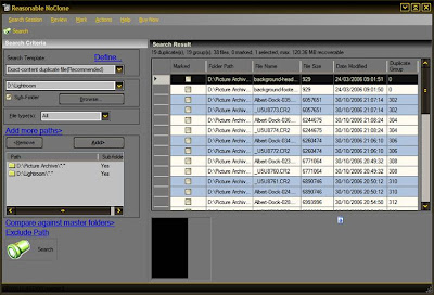
- Select the picture folder on your hard drive on the left and the picture folder you set-up for backups on your external drive on the righthand side (See above image).
- Click the 'Synchronise' button. The application will do the rest.


Monday, February 12, 2007
Design In Nature
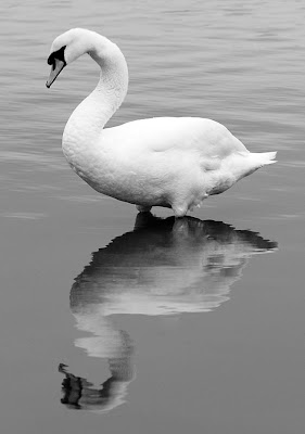
In The Eye of The Beholder?
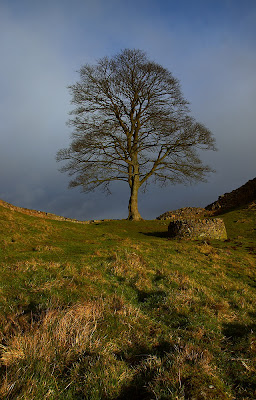
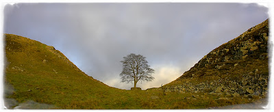
I was recently on a photographic weekend with several practiced photographers and a recent convert to photography. One morning sat on a hill looking at the same tree at the same time. I suggested we all took pictures and then we compared the results. The results surprised even me.
I'll start with myself. I wanted a panoramic symmetrical shot of the scene. So I used a wide lens with the intention of cropping the top and bottom of the image afterwards.

I shot this as a variation of what is an often shot scene. I wanted to include some of the surrounding landscape too. I shot in portrait mode for something a bit different as its not the usual landscape orientation.
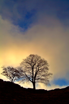
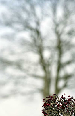
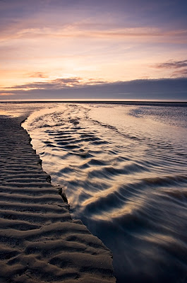
As you remember I did my loner bit and disappeared down the other side of the hill. I'd made a mental note to shoot towards the light source at some stage during the break as most of my previous landscapes have shown lots of detail on the land due to keeping the sun out of shot.
Friday, February 9, 2007
Lars Tunbjörk Exhibition
I recently interviewed renowned Swedish documentary photographer Lars Tunbjörk. Later I attended the preview of his first U.K. exhibition at the OpenEye Gallery in Liverpool. The exhibition consists of three aspects of his work. The Office Series (2001) which shows all the underlying chaos and claustrophobia of the modern corporate workplace. The images are taken with a wry sense of humour while retaining the disturbing claustrophobia of the hot desking, cube farmed, globalized workplace. The second series Dom Alla (All Those) 2002, looks at institutional environments in the Swedish welfare systems.
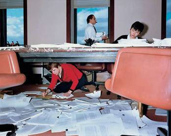
The third and final series in the exhibition is Madrid, 2004 a very stark series of images of the residential developments on the outskirts of Madrid. It is an almost alien landscape punctuated by feeble attempts to add a plant here or a border there. In stark contrast to the Office series there are no people at all in these images. Its a suburban landscape repeated all over the brave new world of Neo-Europe and Lars demonstrates it very well. The lyrics of the Dead Kennedy's came to mind as I looked at this work. The chant of 'This could be anywhere! this could be everywhere...' echo'd round my head. It could have been a statement or a warning and the same can be said of Lars Tunbjörk's well observed photographic narratives. When asked about this he enigmaticaly said simply 'you decide.' and i'd certainly recommend everyone visits this exhibition and does just that.
Wednesday, February 7, 2007
Interview With Hellen Van Meene
 I'm a few days off publication of my latest interview with a profesional photographer. In this case it is with renowned Dutch photographer Hellen Van Meene. I'm just editing the final draft of the article and have to say I'm very excited about how it's shaping up. She's a fascinating and articulate person who's views on her work are extremely interesting. The interview will appear on ePhotozine.com very shortly. I'll post an update informing you when the article goes live. The image on the left is the cover to her book 'New Work' which I'd recommend both for the themes it contains, the quality of the images and as a masterclass in the use of natural light.
In the meantime if you haven't already you could check out my previous two interviews on ePhotozine.com.
Jonathan Taylor - A Photo-journalist based in Asia talks about his work and how to keep your cool and produce good documentary photography work while dining with a contract killer! A real insight into photo journalism from a very talented photographer.
Andy Rouse - The world renowned wildlife photographer Andy Rouse talks about his new work, photography in Antarctica and his future plans. Worth checking out for his award winning images alone. Add to that he's funny and to the point and you're on to a winner.
Monday, February 5, 2007
Shameless Plug
The second is an essay about designing images that work.
Both are recommend reading.
Friday, February 2, 2007
Is creative imperfection a good thing?
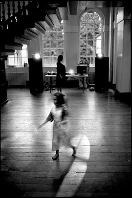
I believe strongly that our eyes and through them our minds really enjoy a visual puzzle. A visual puzzle engages us and holds our attention. It's a feast for the eye and it stops us from becoming bored with an image before we have engaged with it. In fact I'd suggest it is often an images quirks and imperfections that grip us the most.
It's been interesting reading the threads about Cartier Bresson and peoples thoughts about technical perfection in photography. In case you don't already know this image shows where I stand on the subject...
Thursday, February 1, 2007
Double Velvia Vision
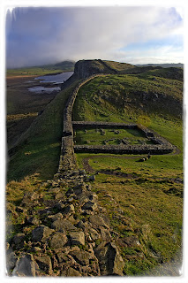 One of the major reasons many landscape photographers avoid going digital is Fuji Velvia film. It is without a doubt a fantastic film for landscape. It has a great colour and tone idealy suited to landscapes.
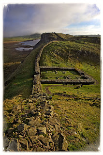
Now i could have done all this myself given enough time in Adobe Photoshop. This plugin did it in 10 seconds 1 click and no effort whatsoever on my part. This gets my vote every time. Less time in Photoshop is more time taking pictures.
Understanding the Abstract
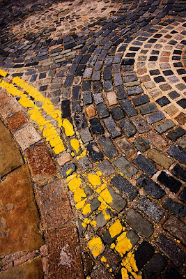 Fellow photographer Chris Shepherd has written and interesting article detailing his thoughts on Abstract Photography. It's a good read and illustrated with a picture I particularly like. To me it is a good example of an abstract image that's both well executed and contains meaning for the viewer.
His views in the article differ slightly from my own so I may at some point write a contrasting article to compliment Chris's. This is not a critisism of the views Chris holds. Quite the contrary as it is different view points and perspectives that make any creative act such as photography unique. The fact our views are simmilar but diverge is no suprise to anyone and i'd certainly not want to change that difference of opinion. I'd add that I wouldn't say one of us is right and the other wrong either. Creativity is never as black and white as this if you'll pardon the photography joke in the metaphor! We all have our own approaches shaped by our own creative perspectives.
This is vitally important as without this no unique work could be produced. We'd all be static and boring clones of each other.
My next article will cover the differing ways photographers can perceive and approach the same subject. Like this note it deals with the 'creative differences' all photographers share and how they enrich photography for us all.
Wednesday, January 31, 2007
Digital Workflow (Part 1) - Appendix
Some tutorials for using Capture One are available on their support page at Phase One's website. I'm a huge fan of this products ease of use and end result as you may have gathered.
Two other workflow enhancing tools to organise images and keyword that I neglected in the article are:
AcidSee Pro - Easy to use and very flexible and feature rich. It has slowed a lot with .tif files when they are in the 100's of Megabytes when I tested it out. This doesn't affect most people of course but heavy photoshop users and people who get above 8MPixels and 4 layers at 16 bit also need to try it out and see if its okay on your machine.
Extensis Portfollio - Superbly fast program to organise and catalogue all your media files including files on offline drives or CD/DVD backups that are not loaded on your computer. It's only drawback is the price is a little steep. Other than that its a fast and solid product.
Thursday, January 25, 2007
Digital Workflow (Part 1) - Organising Your Files
 I'm now less than a day away from my annual trip with my photography friends. As always each year I'm very excited and currently counting down the hours. I realised that weather permitting I'll generate 1,000 plus digital photograph's in the next four days. This scary thought made me consider digital workflow.
You will soon find that thousands of digital photographs on your PC at random can become a huge headache. Files get lost, impossible to find or damaged. Duplicates are created and space gets wasted. As digital photography is now inside so many homes this has become a real issue for many of us. In the past we may have had physical photograph albums and negatives, where as now we have a hard drive. Our eggs are now all in one basket and it has become a worry. You could easily loose a precious image of great sentimental value. Perhaps something you can't ever replace? Worse case you could loose all your photographs in their entirety. If you're a pro or semi pro this could also have severe financial implications and affect your reputation and future business.
In this series of articles I'll cover how to organise your digital photographs, how to back them up and archive them and I'll also cover the image processing essentials to get from your original digital pictures to the best quality print you can manage. We'll start with what to do with your files before you even start work on them.
For the purposes of this exercise we'll assume you have taken your pictures. You are comfortably sat at your PC with your memory card clutched in your hand or your camera in it's docking station. The next thing you need to do is organise those files on the PC.
Preparing a place to store your images
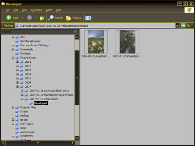
Step 1 - When copying the files from the camera card or the camera itself copy them into one central folder. This folder should be where you keep all of your images. This makes backups easier to setup as you simply remember to backup one main folder.
Step 2 - A good plan after step 1 is to create sub-folders named by year and then under these sub-folders create a folder for each group of shots you take. Name the shots by using a date coupled with meaningful names. Use these folders to organise your files in. A good format of folder name is yyyy-mm-dd-{Photo Name}.
Step 3 - In each sub folder have a folder named 'developed' or similar in which to save you processed images. Never overwrite the original unprocessed image files in case you damage them. Always work on the copies of your originals in the developed image folder. Saving them in a separate location like this helps instill the discipline of not using your original files. Your final file path for images may be something like:
PictureArchive\2007\2007-01-29-HadriansWall\Develops\{file names}
All your files can easily be batch renamed
Irfanview Thumbnail Viewer
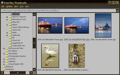
can batch rename files and allow easy and rapid viewing of thumbnails. Best of all this is totally free though a donation to the author is an option well worth taking with this excellent program.
Your files all contain 'meta data'. This is simply a part of the file which holds information about the file itself. In the case of your .mp3 player we're all already familiar with it as this is the part of the file that contains the artist name, track name, album title etc... We see it scroll on by as we listen to our favourite tune. In the case of picture files there is similar information available. You can, for instance, add the photographers name to a picture file. You can also add a description, title, copyright notice and camera information.
Most useful is the ability to add keywords. I'll explain myself. If you have a portrait of a monkey called John and keyword it with the words 'portraits, monkey, John'. What happens later in life when you have 20,000 pictures on your hard drive and need to find the picture file in a hurry? With keywords you can search for files containing the meta data 'portrait, monkey, john' and find your file instantly. As opposed to searching through years and years of files at random. Keywording takes minutes to do when saving your files from the camera and will constantly save you hours of stress in the future.
There are many tools to add meta data to batches of images. If money is an issue and performance is not then Microsoft do a very good tool for metadata editing.
Metadata editor screenshot
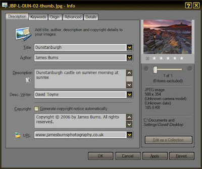
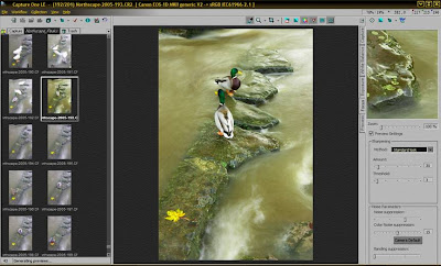
There are also solutions to copy your files to a location on your hard drive. Batch rename them and add keywords and details all within one program. The ones that spring to mind are Adobe Bridge, Capture One LE/Pro and Adobe Lightroom.
Capture One Pro or LE is a program designed to import and process RAW images as a batch it is also able to keyword and rename files. It's RAW processing abilities are second to none in my opinion. I'll cover its use in a separate tutorial at a later date.
Capture One Screenshot
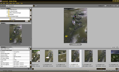
Adobe Photoshop comes with the program Adobe Bridge which allows you to browse all your files as thumbnails, batch rename them, add metadata and keywords and also to send them directly to other programs to edit such as Adobe Photoshop or Adobe Imageready.
Adobe Bridge Screenshot
So at the end of this first article you should have a good idea of programs to use to organise and categorise your images. If you follow the advice in the article you should also have all your images stored in a manner where they can be easily found. No longer will questions about 'Where did I put that image of the cathedral in Liverpool I photographed in April last year?' be an issue. It'll be in the 2006\April\ folder and you can search for the keywords 'buildings, cathedral, Liverpool'. What was a stress is suddenly transformed into satisfaction.
Next time we'll look at back-up strategies to stop you loosing your images.
Tuesday, January 23, 2007
Portrait Photography - Useful Information
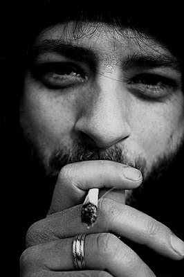 Today I have the mental weakness of thinking in straight lines. This means I must follow yesterday's useful information on landscape photography with resources for portrait photography. As I've stated previously a lot of portrait photography is about your rapport with your subject and their trust of your ability to represent them. This means a portion of these links are a little less specific. I'll start with two portrait photographers of note worth looking at for differing reasons.
Arnold Newman - One of the great masters of the photographic portrait. His work is worth looking at for its great use of space and his ability to use the environment to tell you something about his subject. It's also obvious how great his relationship with his subjects is.
Hellen Van Meene - Renowned Nederland's photographer. Uses natural light and props/costume to produce stunning and original portraits with a very unusual and original feel to them. A great photographer to study for her use of light and colour in an image. Sadly the web can't do justice to how wonderful her prints are in reality.
The next two links are more technically useful with some information you can use directly either for ideas or to improve your technique and ability. This has the side effect of making your subject more relaxed as you'll be working fast and with confidence so they don't have time to panic or doubt your ability.
DG28.COM - This site is the brainchild of Neil Turner. Neil has been a freelancer and then a staff photographer for the Times Educational Supplement. He's a master of his craft and has great lighting and improvisational skills. I think they've been developed by hard work and the need to cope under the pressure of his job. On his website he generously shares his experience, tips and skills to give you great insight and inspiration as to what you can achieve in a portrait.
Planet Neil - A site made by Neil van Niekerk with a splendid tutorial on flash lighting. It is the best tutorial on this tricky subject that I've read anywhere. It's accessible easy to follow and superbly readable. It puts mastering flash and controlling light into the reach of anyone with a flashgun. As available light will not always suffice this is an essential read.
A couple of good books to read on the subject of portrait photography are:
Lighting For Portraits - By Steve Bavister. - A well illustrated and well written book covering the simple lighting for portraits right up to very complex studio setups with examples and diagrams of each style.
Portraits - By Steve McCurry. - A book of nothing but portraits by this most splendid of photographers. Pay attention to his use of colour and background. He reminds me of a rennaisance painter.


